Summary
The primary focus lays in exploring the consumer behaviour and observing the possible ways how to improve and most effectively visually communicate a product through company’s
webpage. The project aims to address current fashion market, where competitive advantage in a form of user friendly webpage and ability to immediately catch the customer’s attention where
desired, might be one of the most crucial elements to success.
The aim of the research is to understand how people view a webpage and if there is a difference depending on if it is a product picture or an environmental picture on the landing
page. To have an ecommerce has become a big part of today’s retailing and understanding how to most effectively design a webpage was therefore seen as interesting. We have
researched the behaviour and eye movement of the participants on the landing page of a brand’s website so as to be able to confirm or reject the formulated hypothesis. The result of
the project will provide a guide for understanding various visual elements of the page and how to effectively organize them in order to increase the profit.
The result proved that attention is naturally drawn to faces and pictures before texts and initial focus is in the center of the picture. In addition, using eye tracking method, the group explored and described the points of participants attention using derived heat map and gaze plot.
Eye Tracking Method
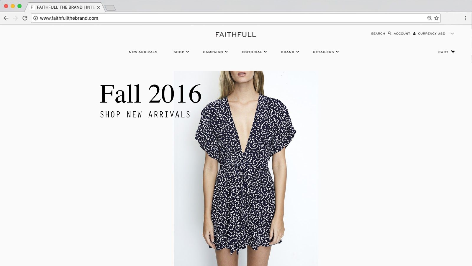
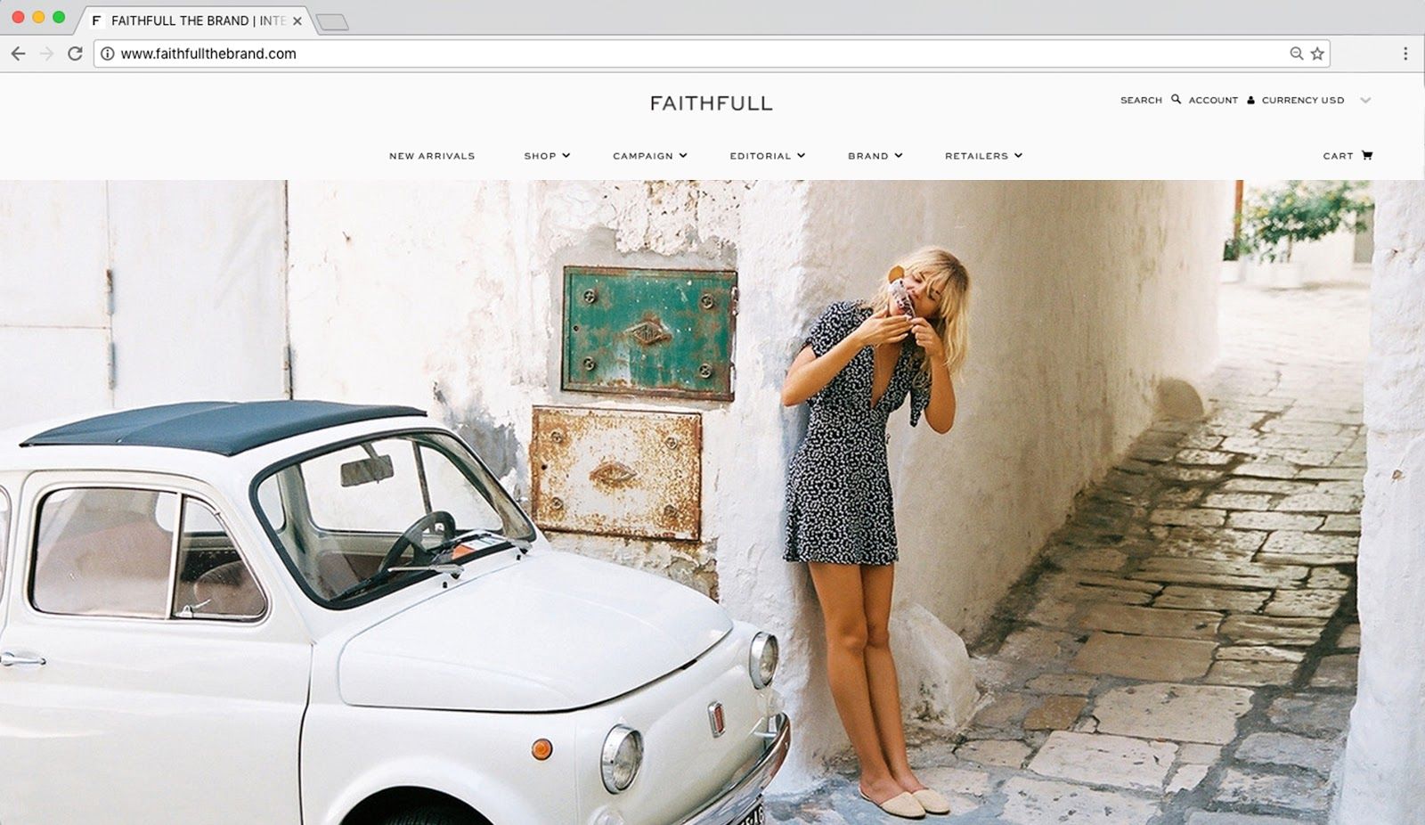
For this study, two pictures were used to compare the fixation order and time spent on viewing the different elements of a webpage if the design varies. One picture (Appendix 1) showed a
product picture with a title that invites the viewer to shop, meanwhile the other picture (Appendix 2) shows the product on a model in an outdoor environment only. Anyhow, both pictures include
menu bar, brand logo, shopping cart, search function, account and currency converter.
These two pictures were tested in the Retail lab at Högskolan Borås using the above mentioned method of eye tracking. The group of participants consisted of 14 females aged between 20-30.
To be able to assure that the results were not dependent on which picture was shown first, the group was randomly divided into two groups, and the order of the pictures was reversed. This means that seven females were in group 1 and they were shown picture 1 before picture 2 and seven
females in test group 2 were shown picture 2 before picture 1.
All participants were looking at each picture for six seconds, a time frame that allowed the candidates to get an overview of the web page. This time frame was set after random tests where the executing group timed how many seconds it requires to get an overview and be able to look at each element of a fashion ecommerce landing page. The average time landed on six seconds, which therefore was set as a valid time frame for this experiment. During the test there were no distractions of significance. The test took place in a lab located within school environment so the setting was not natural, which is something that need to be taken in consideration.
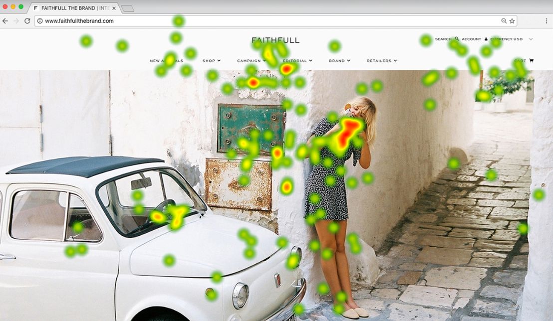
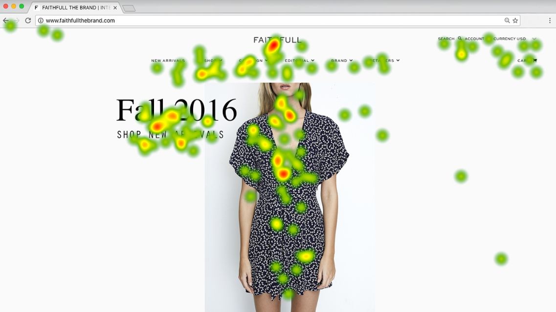
The data from the eye tracking test was shown on a map with numbered dots, a so called gaze plot, in order to see the exact movement of the eyes on the screen. Also, data was shown in a
heatmap that described which spot on the webpage received the most attention, where red is the most viewed element and green are the spots that got less attention. The analysis was
made through a comparison of two heat maps, one for each group. The result from the gaze plot was analysed for each participant to understand the primary focal point and the viewing
pattern.
Results/Conclusion
As previous studies have indicated, the attention of a viewer is first drawn to the middle of the view – regardless what is in the picture. This pattern was proven true in this research, as all the
participants started looking at the website from the center when looking at the first picture they were shown. In the product picture the majority of attention was drawn into the
‘Fall 2016’ text in the picture, whereas the environmental picture triggered the viewers to concentrate more on the face of the model or the ice cream she was holding instead of the
product, text or links itself. Based on these results gained on the eye-tracking experiment the hypothesis is true: people pay more attention to the product and titles if there is no defined
background of facing to distract the attention.
Thus, in order to boost direct sales, placing and presenting the product in less-defined background the sales could be increased as the viewer is more likely to take next step towards
the purchase by concentrating on the links and hence proceeding further in the buying. If the desired impact is strengthening the brand image and communicating the visual values rather
than directly increasing sales, the environmental picture has been proved to draw more attention and make the viewer spend more time looking at the first picture instead of moving
further on the webpage. Further studies could for example examine not only how customers view and prefer the pictures on the website, but also provide deeper knowledge on how the
customers navigate on the website. The findings on the navigation pattern could then be used when planning the structure of e-commerce, that would result the best way possible to boost the
sales as well as strengthen the brand image.