Introduction
As the use of mobile devices is increasing and the use of laptops and computers is decreasing it is becoming more important to design for better web usability across platforms. The established design principles for web design provide guidelines when designing and testing web usability. The principles, however, are not commonly used to evaluate and test the usability of mobile websites. This study seeks to examine how the usability of mobile and desktop websites is affected based on the adaption of established web design principles. The study is built upon an analytical framework where common keywords have been selected from a selection of established web design principles. This study takes on a qualitative approach with experimental features, using a heuristic evaluation, a usability study and an eye-tracking experiment. The study indicates that there is a connection between low adaption of certain keywords of web design principles and the usability of mobile and desktop websites, contributing to a deeper understanding of how adaption of design principles affect web usability across platforms.
Websites included in this thesis are:
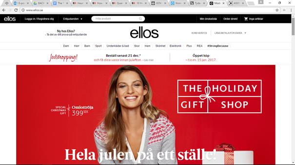
- Ellos
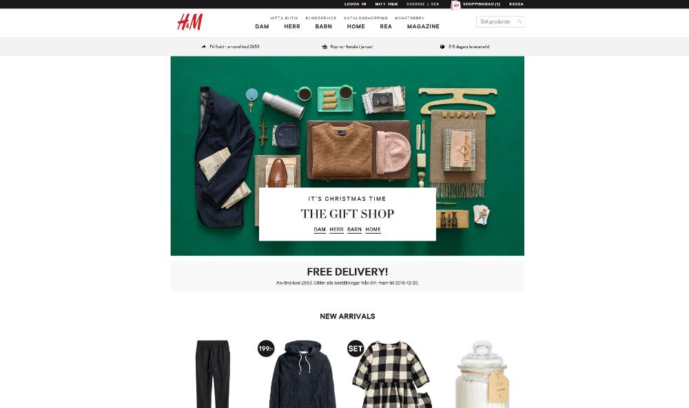
- H&M
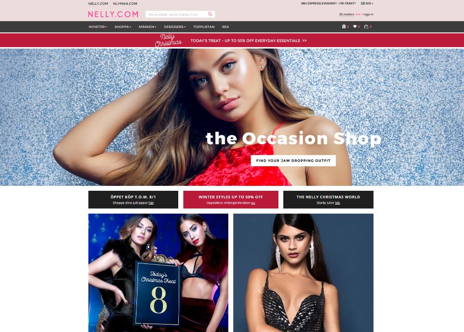
- Nelly
Methodology
The purpose of our research is to obtain more information about the users experiences and preferences, regarding the usability of mobile and full websites in relation to selected design principles. The research strategy chosen to achieve the purpose of this study is a qualitative approach with experimental features, containing interviews, think-out-loud studies, observations and an eye tracking experiment to supplement the observations, to increase the validity and reliability of the study.
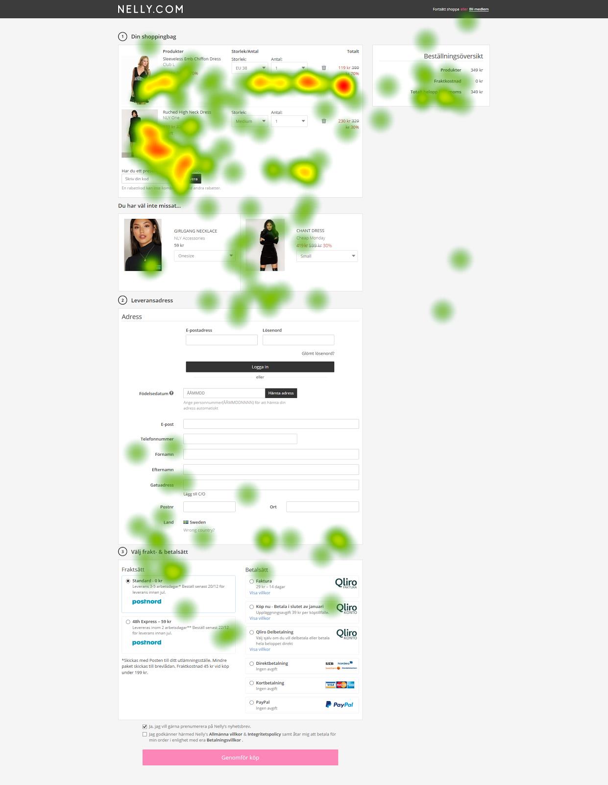
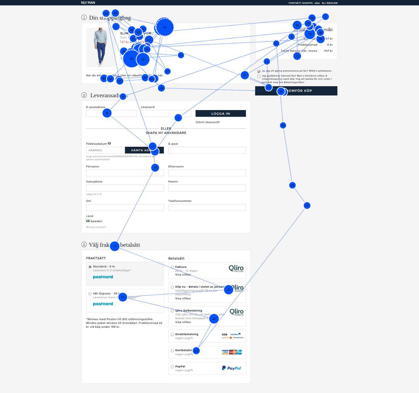
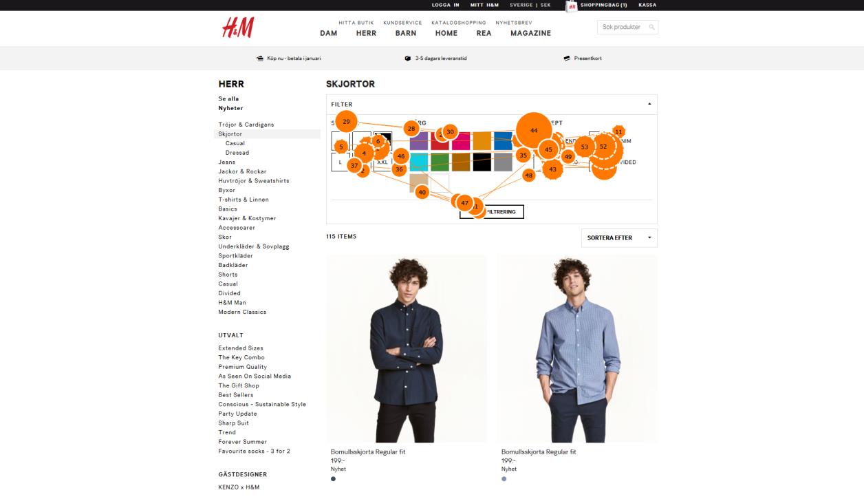
Eye tracking test
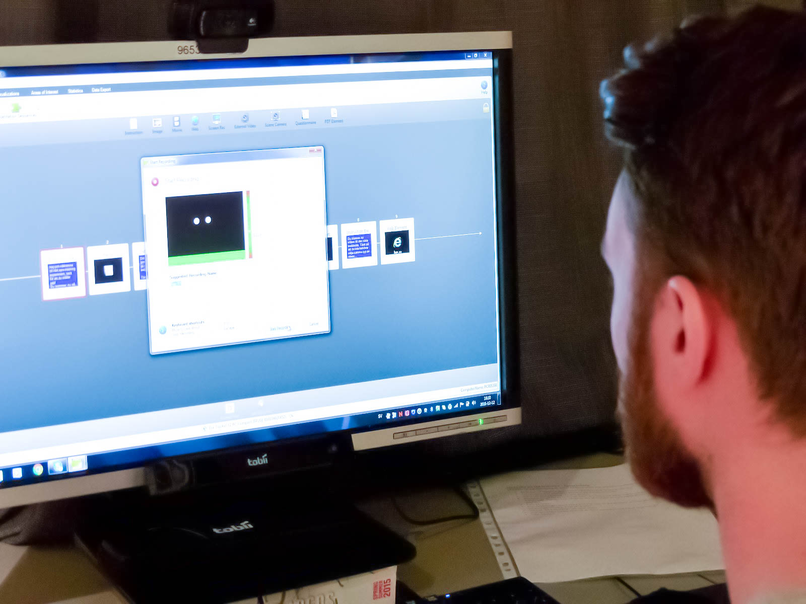
The equipment used for this research was a 24” computer monitor with an eye-tracking device (Tobii Pro X2-60) with a keyboard and mouse connected for the participants to use. The monitor was connected to a laptop which was controlled by the researchers, screening the same view as the participants saw. Both the researcher and the participant controlled the computer, the participants received instructions of what their task was and what equipment to use, the researchers controlled the Tobii software starting the test, switching between websites and finalising the test.
Once the calibration was completed the experiment started. In the first step the participants were asked to complete a short survey with questions regarding their background and experience. The instructions for the test were displayed on the screen and a reminder to think-out-loud and not break eye contact was also included, they were also instructed to only use the space bar and the mouse to minimise the risk of looking down. The first website was opened as the participant pressed the space bar. The participants were asked to focus on the website’s functions, interfaces and designs rather than the products themselves. The participants were asked to behave in the same way as the participants of the usability test, with the addition of the eye tracking instructions of how to sit and where to look. As the purpose of the experiment was to supplement the participants comments and opinions with heatmaps and gazeplots, the sessions were evaluated and analysed in the same way as the Usability Tests. The participants were observed and the eye tracker recorded the sessions, supplementary recordings were also made on an external device.
The gazeplots and heatmaps included in our thesis are meant to support the observational think-out-loud tests. Some of the heatmaps are combinations of the results of several users, and some are individual heatmaps, all gazeplots included are individual results as the combination of several results are too cluttered.
Results/Conclusion
The results of the studies show that many of the participants were divided about many of the websites, some preferred Ellos and other could not stand it, a few mentioned that they did not like Nelly as they did not belong to the seemingly intended target group. H&M was often described as a very neutral, clean and minimalistic website, suitable for most audiences, although some of the participants thought of it as a boring and plain site.
The result of the study suggests that there is a visible effect on the usability based on the adaption of common design principles to mobile and desktop websites. These findings assist an understanding of how the adaption of design principles affects the web usability for mobile and desktop websites. The study also provides an analytical framework of keywords, identified in the design principles established by three separate scholars. Our research further provides understanding of the importance of finding a balance in adapting design principles in web design. This study provides a continuation of researching adaption of design principles to responsive web design and mobile-optimised design. As this study focuses on Swedish websites and is conducted at a fixed location with a limited amount of time and resources we would like to recommend further research in the subject to obtain a more general understanding.
